OCEAN ACIDIFICATION INFOGRAPHIC
Project Description
Creating this infographic for the Save our Seas foundation started with background research and reading of the latest scientific studies on ocean acidification. I then created an elaborate sketch that showed the complete story. After client feedback, the sketch was put into design and tweaked to create the final infographic. The final graphic was published in Save our Seas magazine, as well as online.
Project Details
Client Lushomo
(for Save our Seas)
Date June 2016
Skills Science communication, infographic design
A closer look…
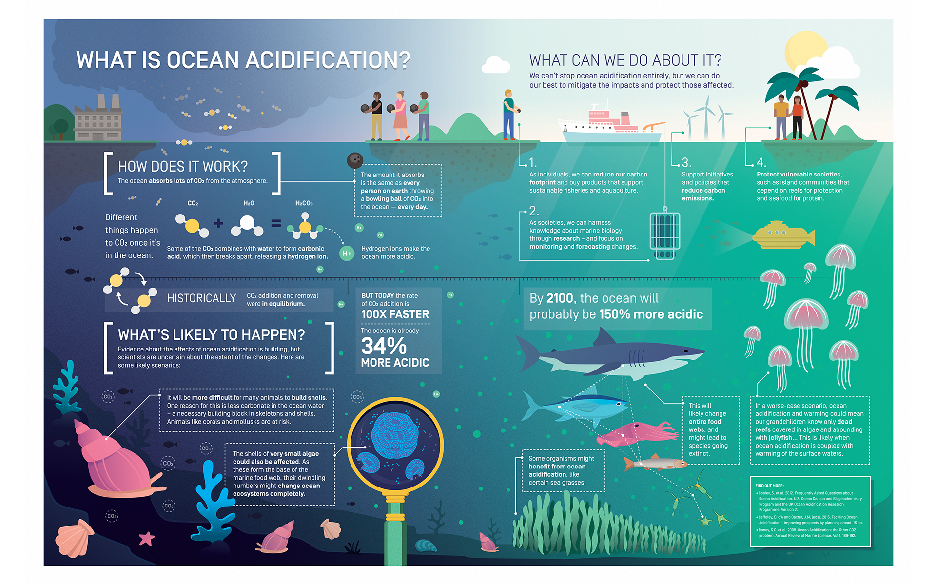
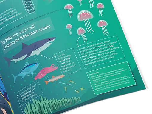
The infographic shows how ocean acidification works, gives likely scenarios that might occur and ends with a positive note on what can be done about it. In the section shown here, the worst case scenario is visually and textually shown by the green hue and jellyfish. A simplified foodweb depicts changes that might occur throughout the marine ecosystems.